
Fabrics and Their Impact on Color: How Texture Changes the Mood of Your Outfit
- coloricrush
- Jan 11
- 2 min read
When building a wardrobe that truly reflects your style and palette, color is only part of the story. Fabric and texture play an equally important role in how colors appear, how they interact with each other, and how your overall outfit is perceived. Understanding the relationship between fabric and color is essential for creating harmonious, flattering looks.
In this guide, we’ll explore how different fabrics influence color perception and styling, and offer tips on how to combine textures for maximum impact.
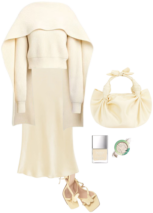
🧵 Cotton: Soft, Casual, and Versatile
Overview: Cotton is breathable, lightweight, and versatile. It absorbs dye well, giving colors a soft, true-to-palette appearance.
Perfect for casual wear or layering
Colors appear matte and natural
Easy to mix with other fabrics without overwhelming the outfit
Styling Tip: Pair cotton pieces with silk or wool to add depth and avoid a flat monochrome look.
🧵 Wool: Warmth and Depth
Overview: Wool is cozy, structured, and adds richness to colors, especially warm autumnal or deep winter palettes.
Enhances the depth of darker shades
Adds texture that makes solid colors visually interesting
Ideal for outerwear, skirts, and tailored trousers
Styling Tip: Combine a wool blazer with a cotton blouse or silk scarf to create a layered, tactile look.
🧵 Silk: Elegance and Fluidity
Overview: Silk reflects light and adds subtle shine, making colors appear luminous and sophisticated.
Ideal for formal outfits or evening wear
Colors gain a soft glow and appear more vibrant
Drapes beautifully over the body, enhancing silhouette
Styling Tip: Pair silk tops with matte fabrics like wool or cotton to balance shine and structure.
🧵 Linen: Light and Airy
Overview: Linen is breathable and slightly textured, giving colors a muted, soft appearance.
Perfect for spring and summer palettes
Colors appear relaxed and effortless
Adds natural, casual sophistication to outfits
Styling Tip: Mix linen with soft cotton or silk to create a balanced, breathable layered look.
🧵 Velvet: Luxury and Intensity
Overview: Velvet has a plush surface that absorbs and reflects light differently, deepening colors and adding drama.
Colors appear richer and more luxurious
Perfect for statement pieces or evening wear
Adds depth and dimension to solid-color outfits
Styling Tip: Use velvet selectively—like skirts, blazers, or accessories—to avoid overpowering the palette.
How to Combine Fabrics for Maximum Color Impact
Balance textures: Mix matte fabrics (cotton, wool) with reflective ones (silk, velvet) for visual interest.
Mind the season: Wool and velvet work beautifully in fall/winter; linen and cotton are perfect for spring/summer.
Enhance your palette: Use fabric texture to bring out nuances in your armocromia colors—shiny fabrics amplify vibrancy, matte fabrics soften intensity.
Play with layers: Layering different fabrics in the same color family adds depth and sophistication to your outfit.
The right fabric can completely transform a color and elevate your look. By understanding how textures interact with your armocromia palette, you can create outfits that feel cohesive, flattering, and uniquely yours. Whether it’s the cozy depth of wool, the soft glow of silk, or the relaxed elegance of linen, fabrics give your colors life, movement, and personality.
Still figuring out your season? Or want help turning your palette into real outfit ideas? Book your color analysis or style session via this LINK.


Comments